Journal 1
We’re in the business of redefinition here at Polestar. Redefining performance to be about more than just straight-line acceleration. Redefining the retail experience with spaces staffed by non-commissioned product experts. And so on.
Finding yourself
Polestar is a company of people with an absolute obsession for refining every detail. The product is always at the centre of what we do. The same attitude is present in all fields, whether it is chassis components, carbon fibre solutions or typography. The visual brand identity of Polestar is the result of this passion. It is created in the same way and with the same uncompromised attention to detail as all Polestar products. To create a superficial visual package to express this perfectionist approach would simply not have been authentic or good enough. This journal describes how and why our identity came to be.
Polestar was created to break free from the conventions of the automotive grid. The brand seeks to explore new ideas and technologies, to push boundaries and spearhead the Volvo Car Group not only in technological innovation but also in areas of digitised customer experiences and communication.
"Being part of the Volvo family gives us enormous confidence in knowing we have production and quality processes in place to realise our great ideas. The automotive world is changing. Connectivity is a basic necessity. Car sharing and new types of ownership are becoming standard. We embrace all of this. We will lead the way. Polestar is the Guiding Star," says Thomas Ingenlath, CEO, Polestar.
Being a guiding star for Volvo is a great challenge. Polestar is however a brand that can also engage different customers than Volvo and is determined to make its own mark in the automotive industry.
The name
The North Star has guided travellers on the Northern Hemisphere throughout history. As a symbol of guidance, it is a fitting metaphor for a company that will act as the forerunner, a guiding star, for the Volvo Car Group. The name Polestar has a meaning in itself. In Swedish, the North Star, or Polaris, is referred to as Polstjärnan. The literal translation meaning "Pole Star".
Polestar, for many years, has been a well-known name to people familiar with Volvo's performance cars or with an interest in World Touring Car Championship. Volvo Car Group acquired Polestar with an ambition to leverage its performance and engineering experience.
With a new agenda for the future, it was important for the Polestar team to remain true to its heritage, whilst reshaping the company for a new challenge. The metaphor "Pole Position" still sits at the core of the Polestar mindset. It represents both the heritage and the ambition to push boundaries with our pure, progressive, performance cars.

The Identity
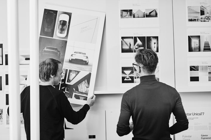
The constant search for refinement and our progressive mindset have defined our uncompromised ambition. In all communication, the objective has been to elevate the technological advancements and allow the products to stand proud as pieces of art rather than using traditional marketing. This approach could be perceived as somewhat exclusive, but the authentic product focus could not be celebrated more clearly.
The overarching design principles behind all Polestar products are represented by three main elements: Pure, Progressive, Performance - all based on what the brand is created to deliver.
Pure; product minimalism. Progressive; scientific innovation. Performance; uncompromised and athletic.
There is a pure minimalism in the typography and colour scheme. The progressive and scientific outlook is evident in the attitude towards everything from architecture to the precision in the star symbol.
The uncompromised performance is not only related to how the cars behave, but is also visible in the attention to detail and determination to constantly deliver something new and better.
Based on these principles, the team at Polestar found inspiration and ideas in businesses far from the traditional automotive industry and discovered unconventional elements. With these elements, the right balance and a very useful toolkit were created.
The visual identity is applied to every part of the Polestar universe. The cars themselves carry both the symbol and marking text. The events, the show stands and offices all follow the same principles. Stationary, imagery and online car configuration do the same. Similar, distinctive focus on typography and colour control can be seen anywhere from toilet signs to business cards. The restrained consistency in the execution has become as much a part of the identity as the visuals themselves.

The Symbol
The old Polestar symbol has been seen on Volvo cars for many years. The symbol was used on a bright cyan-coloured plastic square that Volvo owners proudly showed to tell neighbours they owned a unique and high performing Volvo. The colour was, however, the strongest element in this combination. Hence, when defining the new look for Polestar, the star symbol needed to be liberated from its square blue base.
Handling the star as a proud and free object would make it possible to place it nicely on the cars. But the symbol itself needed to be updated to be strong enough on its own. The symbol should be able to act as a unique signature, free from any need of explanation. It had to be pure and minimalistic, yet with a strong presence.
A great number of star symbols and logotypes already exist. Not even in the car industry is this a unique element. Knowing this, the Polestar team decided to modernise this classic form and let the Polestar attitude lead the way, rather than traditional automotive thinking.
The star was reduced in a series of iterations until only two wings remained. The wings are placed diagonally towards each other and the space between them completes the shape. The slight vertical offset adds extra tension without losing the connection. The top surface of each part has a diagonal crease. The three-dimensional star on the car, where these slightly angled surfaces meet contrasting surfaces, is a real jewel. Crisp and beautiful without having to use a single piece of chrome.
The version of the star developed for communication has the same shape and proportions. The slight crease on the top surfaces remains, which adds a technical and unique look in times when company symbols tend to look more and more flat and rounded.
The symbol evolution video below shows some examples of different proposals from the development process.
The Typography
In order to create a clear yet consistent identity, the Polestar brand team insisted on selecting one single typeface for all channels. The typeface had to be unique, but also timeless in order to be used in new applications for many years. There was no explicit strategy to challenge conventions in the automotive industry, but the team was determined to find a category-neutral typeface that could transcend into other areas than the car business.
The easiest way forward would be to ignore the whole problem with finding a typeface and use Helvetica, a typeface so commonly used and flexible that it could fit in most cases. In the first rounds of development this was the typeface used but it turned out to be too generic. The appearance of the typography would benefit from something more pure and modern.
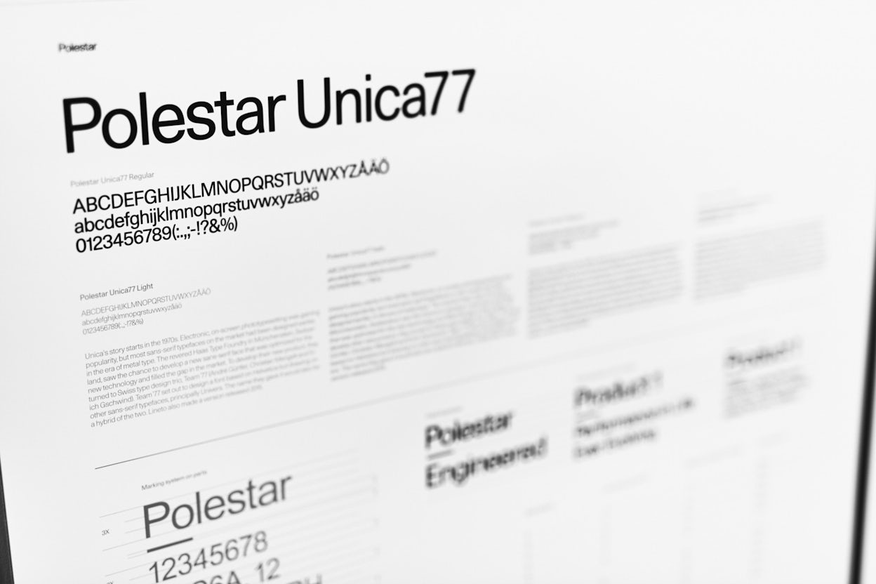
The Unica77 typeface became the natural choice. Used on products, buildings, stationery and in communication – it becomes a very important, yet subtle identity component. Even the company name – the Polestar wordmark, is written in Unica77.
“It’s a clean and pure typeface that really suits the deliberate effort to keep things as simple as possible. Usually, it’s much more complicated to create something simple, but when we discovered Unica77 we found it fulfilled the exact needs of Polestar. Hence, there was no need to create a new customised typeface when there already is one that works perfectly,” says Björn Kusoffsky, CEO and founder, Stockholm Design Lab the external creative identity partner.
The usage of the typeface is as important as the typeface itself. The typical Polestar typography includes only one size and one weight. This minimalistic and extremely consistent look strengthens the impression of a brand that is both progressive and has high aesthetical ambitions.
Read more about the history of the Haas Unica typeface.

The Colours
Polestar’s monochrome colour palette is a minimalistic foundation on which accent colours are allowed to add life and energy. This digital and athletic influence is the addition that makes something that could be perceived as a dull colour scheme into something outstanding and powerful.
The foundation is Polestar white, which is generously used throughout because of its pure, clean and luminous expression. It’s also a very practical colour that makes small details stand out perfectly. Polestar black is the ultimate sign of elegance and style. The white and the black together create a timeless simplicity, and also a subtle salute to Polestar’s cosmic origins.
The Polestar greyscale is used as additional colours and contains everything that happens in the spectrum between white and black. Polestar’s accent colours will stand out, but only when needed. Overall, the colour palette is very understated, not claiming a certain brand colour, just as all the other elements in Polestar’s brand toolbox.
The team also wanted to emphasise a difference between material colours and web colours. Gold is the best example of a colour that can only be used on a physical material since it can be pigmented and defined as a nuance.
All accent colours are used in a way in which they never dominate the impression of an image or an exhibition hall. This gives Polestar both freedom and a strong character with a high level of integrity.
The Marking Principle
The pure and uncompromising approach to product design, which borrows more inspiration from the world of non-automotive products, led to a desire to use graphics in new ways. In the traditional automotive world, cars are marked with chrome logos and emblems with very little connection to the products they sit on. The designers at Polestar wanted to integrate the graphics and typography into the product design from the beginning.
The team was keen on finding an additional visual tool that was simple, descriptive and could be applied in a lot of different contexts. This principle also grew in importance in order to align with Polestar’s scientific mindset, as the marking also became a natural element beyond the product, for example on a building or in an invitation to a Polestar event.
As all product manufacturers, Polestar has to follow the international Origin Marking legislation for import/export goods. This has to contain material specifications, registered article numbers, the “made in” specification and many other details.
During the development process of the visual identity, the very idea of using the marking principle outside of legislation purposes became attractive to the brand team. Marking principles are ruthlessly functional, timeless and transparent, so why not apply the same thinking to the visual identity toolbox as well?
With this insight, the brand team put a special focus on how to present the marking on the product and extending it to other areas of communication. It was the start and the birth of what later became the Polestar Marking Principle in Unica77, with the addition of a small but important element: the em-dash.
“Every detail of a car has its mark of origin imprinted in one way or another. We decided to elevate the marking principle, design it and make it a branding element instead of hiding it. Partly because we believe the information is relevant for the customer, and partly because Polestar is a high-tech driven company with unique solutions. You will notice the Polestar Lock-up not only on the exterior and the interior of our cars, but also in our labs and offices. Simply because it’s a very effective way of describing an object or a place. It’s very to the point, just simple facts put in order,” says Pär Heyden, Head of Brand, Polestar.
